Color Inspiration

Creating Color: Behind The Scenes of Trend Forecasting

CI_creatingcolor.png

Whenever I tell someone that my profession is working as a color trend forecaster, I often get a lot of blank looks. It’s a relatively under the radar field, and those that have heard of it rarely understand what it involves.

At its root, color forecasting is a tool that helps companies gain an edge by understanding shifts in the consumer landscape and the trends that will appeal to their customers.

What's It All About?

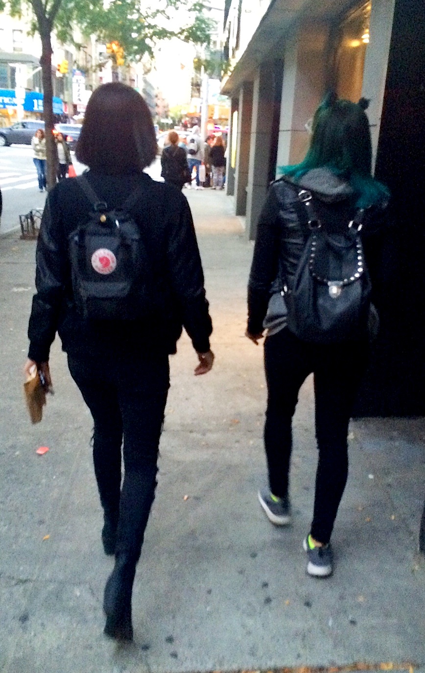
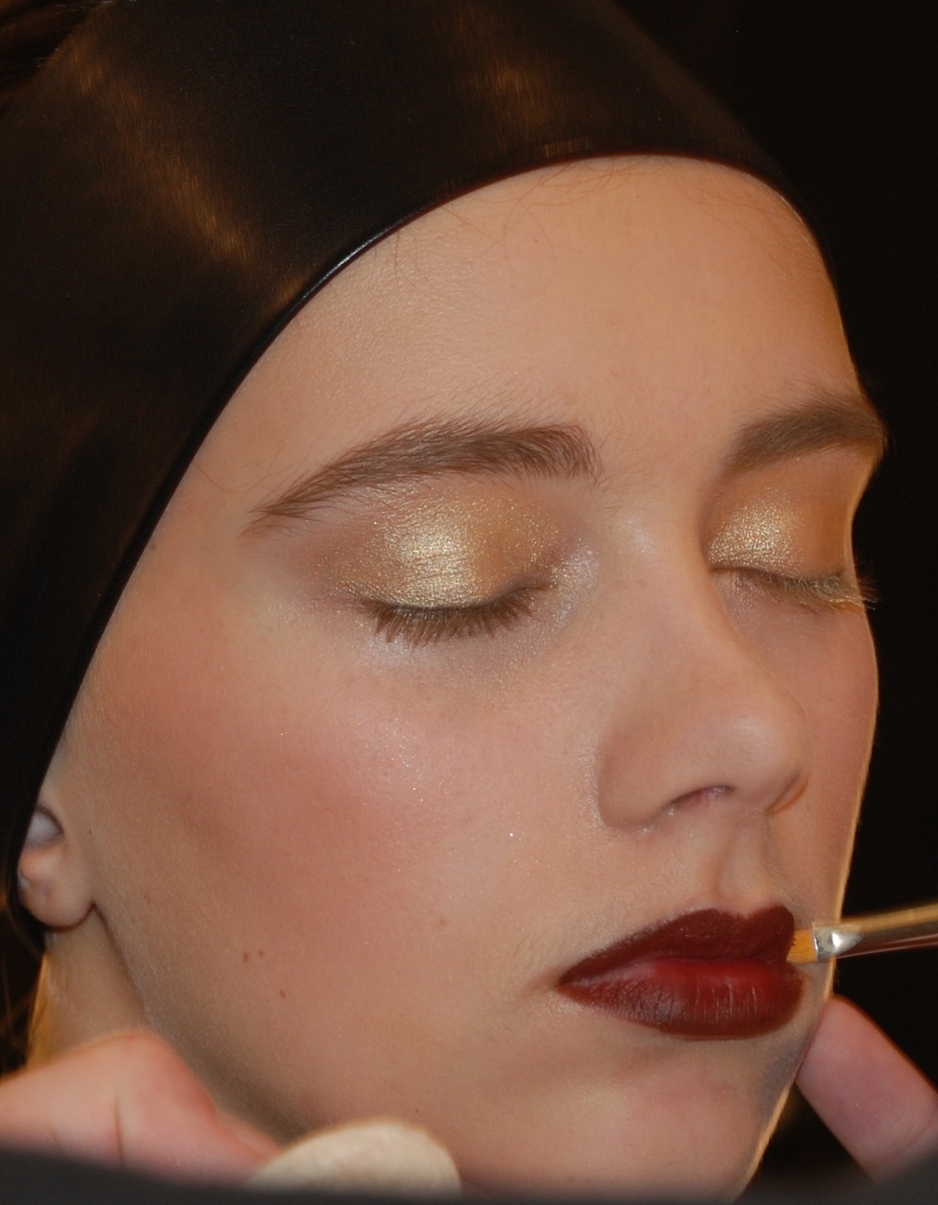
Have you ever wondered how products go from a concept to the runway to the sales floor? There is a reason that all of a sudden, it seems like everyone is wearing fuchsia lipstick. This is the work of color trend forecasting.

A trend forecaster seeks to anticipate cultural nuances, socio-political shifts, innovative design and technologies to inspire the latest and greatest within a particular industry.  There is no magic crystal ball, but instead a practice that relies on research, observation, analysis and intuition to connect the dots.

CAUS_16.jpg

What Does The Process Look Like?

These Are The Basic Steps That Go Into Creating A Color Trend Forecasting:

1. Observation: A key component to trend development is watching to see what is going on in the stores, on the street, at events and on the runway. Pretty much everywhere you look can be considered a source of inspiration. As a trend forecaster, your brain never fully gets to rest.

2. Research: Investigating what is on the horizon is what sets apart a trend forecaster and a   cool hunter. Since we are generally working up to 2 years ahead of the selling season, it is important to keep on top of new innovations. Visiting tradeshows, speaking to manufacturers and learning about new technologies all help to create a vision of the future. Understanding what the world will look like for the season in question is an important part of this step. This includes reviewing the art, design, architecture, film, entertainment, and sporting events that will help shape our tastes

3. Analysis: After collecting all of this information, the real work begins. Recognizing patterns is a central part of the process.

4. Intuition: This one is hard to teach. It’s all about instinct, understanding cultural cues and trusting your gut

Some trend forecasting agencies rely on the intuition of one particular expert, a method I refer to as the “guru model,” to analyze market trends. Decisions are made based on the thought leadership of this leading specialist.

Others, such as The Color Association of the United States, embrace a slightly more democratic process by enlisting the help of a panel committee of experts. These influencers are tastemakers in their specific industry. They are often designers, retail buyers, stylists or merchandisers. When they come together it is an explosion of creative energy. At these committee meetings, any source of inspiration is fair game. 

beauty_ss18.jpg

What happens at a Trend Forecasting Meeting?

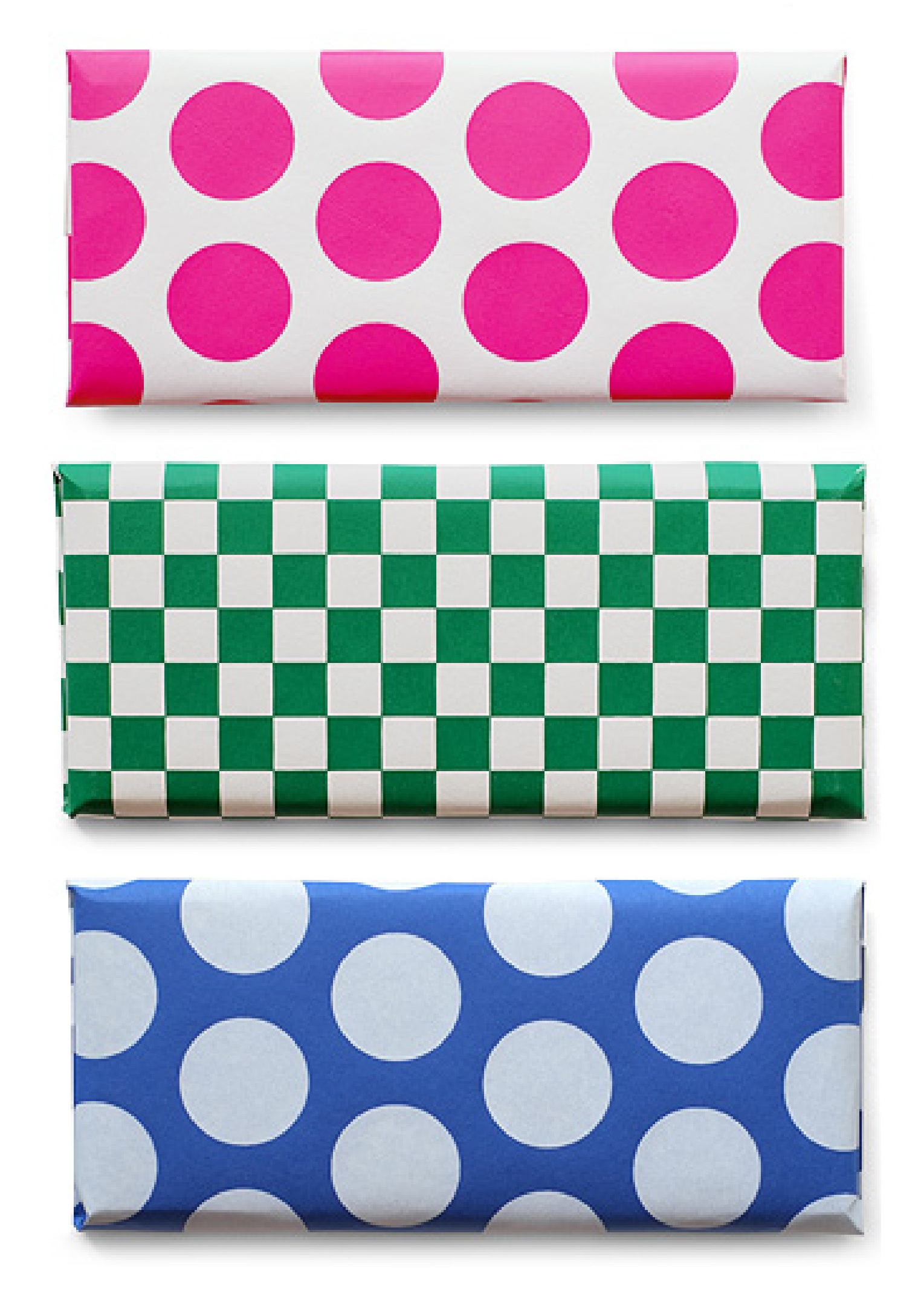
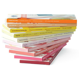
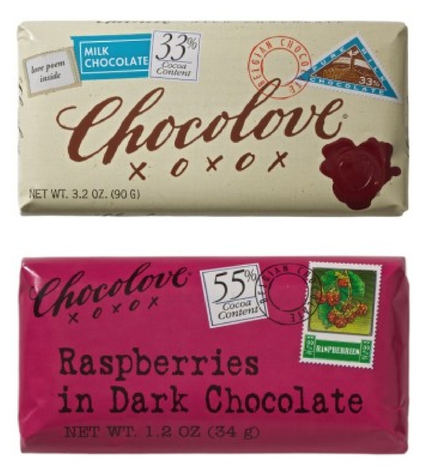
Sharing of Ideas: Each panelist brings in what they think will be the driving influences for the season. These resources are often magazine tears, color swatches and found objects, though sometimes, people get very creative. I have seen everything from dried flowers and artisanal salt to vintage playboy magazines to inspire the development of a nuanced color palette. Influences can be researched and be presented as fully formed concepts, or they may capture a feeling, moment or simply, a color.

After everyone has presented their seasonal inspirations, the next step is to identify synergies within all of the committee members’ inspirations. Often times, panelists have picked up on similar influences, which means the trends  - and colors - overlap. This process begins to outline dominant themes, and highlights commonalities in inspiration as well as colo

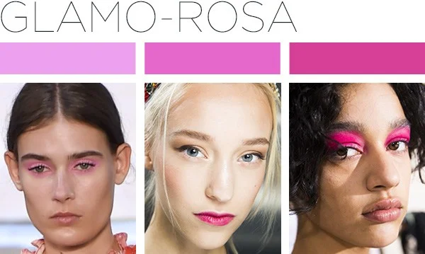
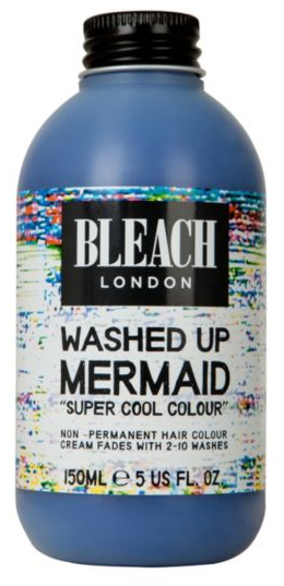
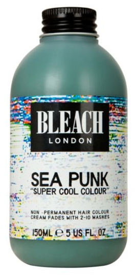
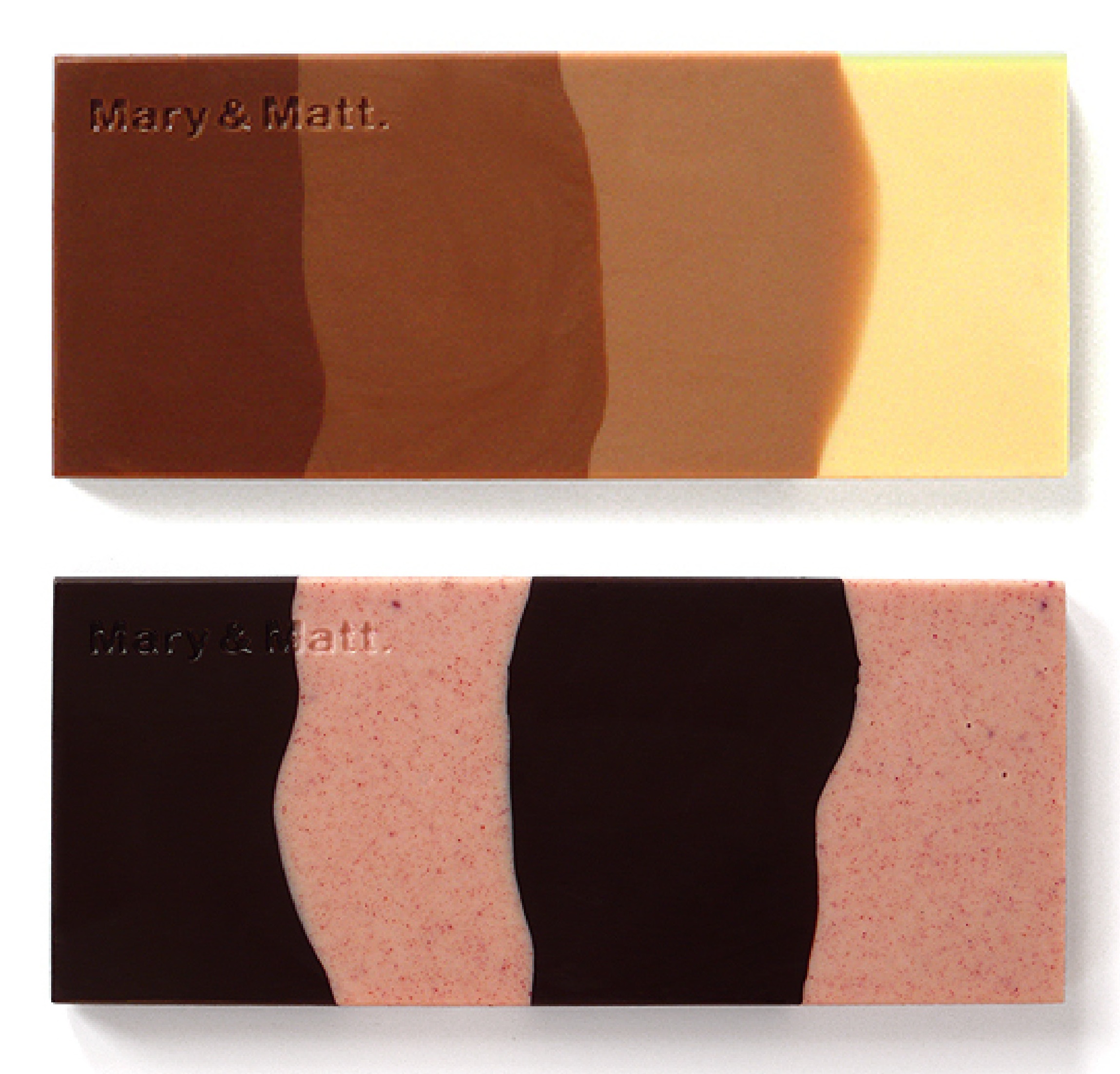
Once the trend stories have been confirmed and the color palettes are developed, each trend color is named. These names connect back to their driving influences

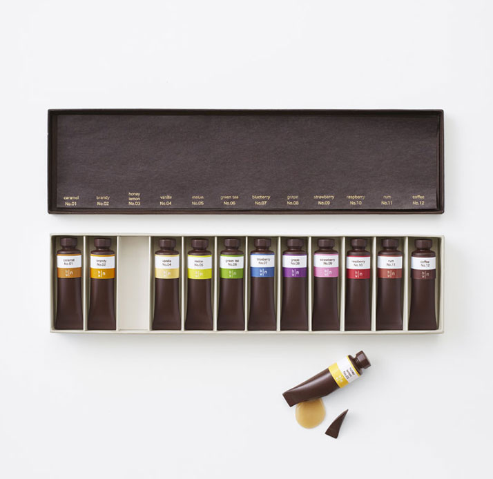
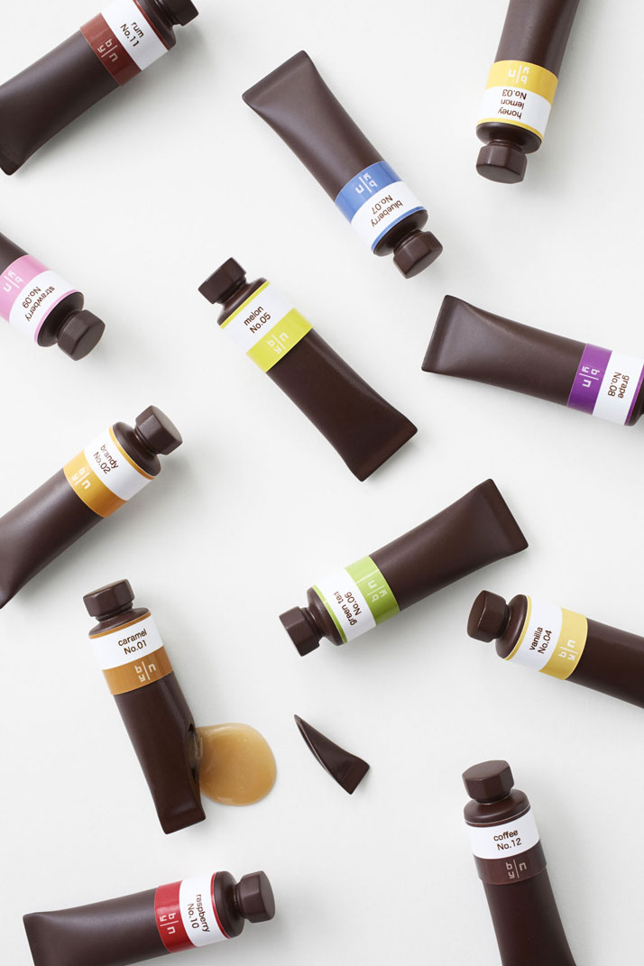
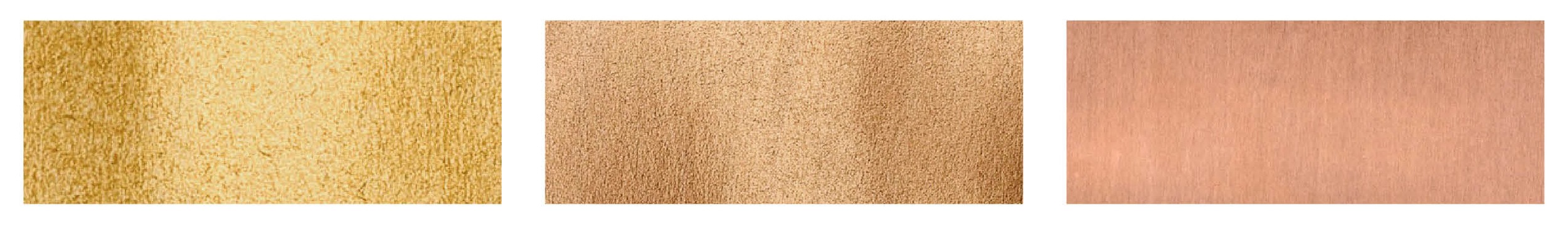
Depending on what company is producing the forecast, colors may be appear on color cards as dyed swatches, or have a reference to a color notation such as Pantone so that designers can match the color to a reference in their library.

From here, designers, marketers and merchandisers buy subscriptions to these color cards, influencing their creative output, be it the products they develop, in-store displays and promotional materials

beauty_techford.jpg

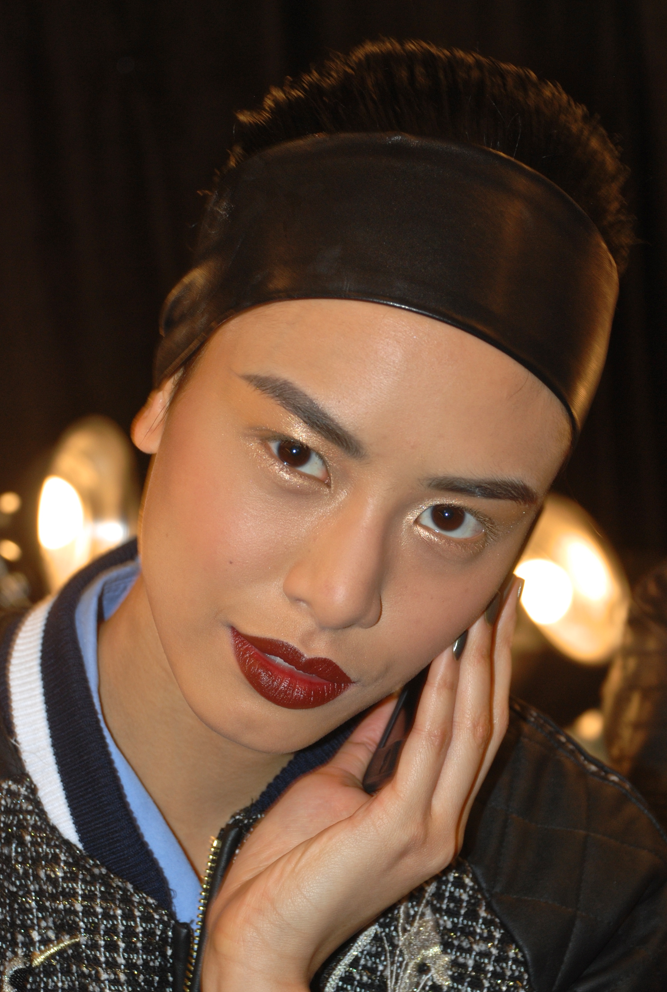
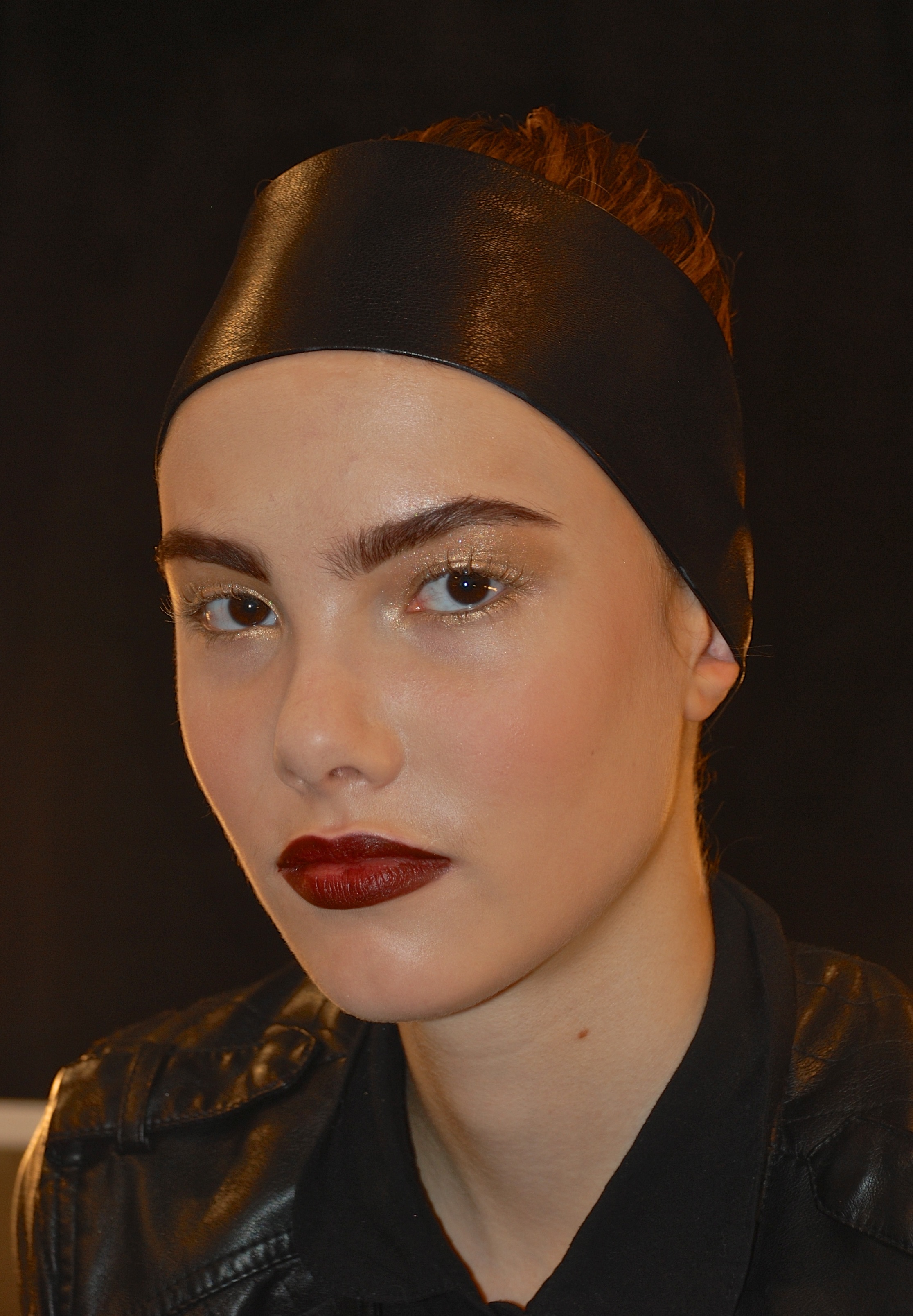
When it comes to beauty, trend analysis can assist in the development of everything from scent – and what we want to smell like – to whether or not matte nail polish will be in this season. Color is one of the biggest influences that encourage purchasing behavior, and as such, color forecasting is big business in beauty.

In recent years, color forecasting has been given a more visible role in retail through the marketing practices of color agency Pantone. The brand has worked to popularize their “color of the year” through partnerships with industry relevant businesses such as Sephora. Despite my personal view that there is not a one-size fits all color for the year, Pantone has become an industry authority, leading many brands – from boutique to mass market– to follow its direction. 

Written for and published by Counter Intelligence


SPRING / SUMMER 2016 REAL-TIME BEAUTY COLOR TRENDS

Spring/Summer 2016 is fueled by a sense of distinction. Individualism is at an all-time high. Women are tired of trying to be someone or something other than themselves, and are embracing a more accepting attitude. They want to achieve the best version of themselves, rather than an unattainable ideal.

This season, unique looks were created for individual models at select shows on the SS16 runway – a testament to the heightened desire for personal expression. This exploration is expressed in two divergent movements. The first is a minimalist aesthetic that favors a sleek “no makeup” makeup look, relying on color correcting concealers and a light-handed contour to create an enhanced version of natural. The second takes a more maximalist approach, celebrating color whole-heartedly with bold strokes of the season’s biggest hues. These are featured below in the most indispensable color trends in cosmetics for SS16.

bluebuzz.jpg

BLUE BUZZ

Blue has been buzzing for a number of seasons, and SS 16 sees this cool tone gain even more momentum. A current societal preoccupation with water—from rising sea levels to floods and droughts—brings us face to face with aquatic influence. Splashing out around the eyes in shades of aquamarine and azulene, the look is clean and deliberate, with minimal makeup on the rest of the face. Waterlines are coolly defined in cobalt, or shaded with a single swipe of lapis. Jet-black mascara is upgraded with a slick of sapphire on lashes. Nails lighten up with playful, paler tints in robin’s egg and sky blue hues.

On the runway at: Mary Katrantzou, Roksanda Ilincic, Monique Lhuillier, Missoni.

summerberry.jpg

SUMMER BERRY

Evolving from the shadowy darks of Fall/Winter 2015-16, intense berry tones ripen as the mercury rises, imbuing ethereal sundresses with an edge. Breaking with traditionally fun and flirty warm weather hues, this sultry femme-fatale style sizzles in the summer heat. A blend of burgundy, smoky purple, and a hint of brown combine to create this intoxicating and dramatic hue. Lips are deeply stained or perfectly defined in matte textures.

On the runway at: Givenchy, Burberry Prorsum, Cushnie Et Ochs, Emporio Armani.

grownupglitter.jpg

GROWN UP GLITTER

Glitter grows up this season, with futuristic touches of twinkling pigments and foil. While classic metallics like copper, silver, and gold are most prominent,a twinkling rainbow of shimmering hues is coveted as well. Execution is key, with carefully applied touches of the sparkly stuff on strategic areas around the eyes. A little goes a long way with this flash-forward look, ranging from a delicate row of gemstones to silvery lash tips. Nails take on a subtler effect, in whitened platinum and icy pearl polishes.

On the runway: Delpozo, Leitmotiv, John Richmond

glamorosa.jpg

GLAMO-ROSA

Bringing a touch of lady-like glamour to the season, pink prevails with a sense of whimsy and fun. Women’s fashion has slowly transformed the rosy hue into a modern symbol of female empowerment, and beauty closely follows suit. Cool undertones root this season’s pink in elegance, toning down a girlish connotation. Placement remains classic on the lips, while also taking an adventurous turn, with bold washes on the eyes.

On the runway: Prabal Gurung, Cynthia Rowley, Giamba, Dolce and Gabbana


Written for and published by BeautyMatter

All images courtesy of Vogue Runway

Teal Appeal

Pastel hues have become de rigueur on the strands of It girls everywhere. As women become more comfortable with unconventional color, deeply saturated hues enter the market for hair. Leading the movement is teal. The shade became popular in the cosmetics and nail category last year and is now starting to make waves for tresses. The combination of blues and greens combine for shimmering mermaid-esque manes.  Influencers such as Nicole Richie, Kylie Jenner and Langley Fox are experimenting with cooler tones.

Color-forward London-based salon Bleach is a pioneer of this water-inspired hue. Their DIY dyes in Washed Up Mermaid and Sea Punk encourage a relaxed ocean vibe. 

Sweet Inspiration

I often look to industries outside of the one I'm working in for inspiration, finding an innovative approach to color, texture and packaging.  The chocolate industry has seen a surge of creativity, full of interesting design in both product and wrapping.  

Lisa Doyle of GCI Magazine recently interviewed me about the importance of color in packaging. In the feature, she explores why I've been drawn to this recent inspiration:

The chocolate industry is leveraging packaging in creative, interesting ways. Chocolate has carved out a niche, similar to that of coffee, tea and salt in the last couple of years, with an explosion of boutique, artisanal brands. It has been repositioned for its healthful benefits, to appeal to a youthful demographic.

Packaging plays with various types of paper and foils, mixing matte and glossy textures and of course, color! The palette shifts from its historically brown roots, embracing bright engaging hues to appeal to this new market. 

 Click here to read the full article. Browse through the slideshow below to discover some cool and colorful cocoa in the market! 

GCI Feature: SS 14 Beauty Trends

Each season, fashion "month" inspires myriad color trends. In response, beauty trends must work to complement the fabrics and textiles that global fashionistas will adorn themselves with in coming seasons. April's issue of beauty trade publication GCI Magazine features my thoughts on cosmetic colors to look out for this Spring. Warmed-up metallics and smoky plums are two of the key hues to embrace as the temperature rises. Click here for the complete story.

Backstage Beauty Pass : Pamella Roland

New York Fashion Week  Fall / Winter 2013-14

February 11, 2013

On Monday, I stopped by the tents to see my friend Matin - lead makeup artist for Laura Mercier and CAUS beauty committee member - who keyed the Pamella Roland show. The palette he created was inspired by Roland's collection; an homage to the opulence of St. Petersburg and the Winter Palace. Cue luxe gilding.

The models at the Roland show had perfectly defined dark red pouts set against flawless matte skin (Mercier's signature). Eyes were washed with soft gold.

To get the look, artists applied Mercier's Oil Free Suprême Foundation or Silk Crème Foundation to skin, and set with translucent powder. Lips were outlined in Coffee Bean and filled in with Deep Wine. Lids were swept with Gold shadow and finished with a slick of mascara.

Hair was swept into a sleek french roll and secured with a wide, shiny black headband.

Though we're only on the fifth day of New York Fashion Week, it is apparent that the popularity of oxblood will continue into next season as it has been featured at many shows this week.

pamellaroland_beautyf13.jpg

Blue's the Hue for Spring Beauty

beautyblues.jpg


Direct from the catwalks for Spring/Summer 2013, tints and tones of the coolest hues are making a splash in fashion and beauty.

In August of 2011, I reported on the variety of blue tones starting to make waves in beauty. At that time, the newly launched Beauty Forecast from The Color Association of the United States (which I produced) highlighted green-based blues for Spring/Summer 2013.

Fast forward to present day -  WWD just released its beauty trend roundup  for the upcoming season with an article titled "Fade to Blue". The headline reads "From a hint of teal to all-over aqua, hues of blue ruled runway makeup from start to finish this season."

The blue family continues to gain momentum. As our relationship to the environment evolves - from a connection to the general idea of "green", to a more focused appreciation for water including conservation and preservation - tonal blues, teals and turquoises enter the forefront.

Like a proud mother, it's exciting to see the validation of my labor. CAUS's record for accurately forecasting trends (since 1915) continues to be right on target and I can't help but be thrilled to be apart of it!

caus_ss13_oasis.jpg


Images: Courtesy of WWD and The Color Association of the United States

Cooking with Color: Sweet Potato Lasagne

sweet-potato-lasagna.jpg


cooking-minute_roseanna-roberts.jpg


One of my favorite ways to unwind after a crazy New York City day is to get into the kitchen and cook something delicious. I love to bring my passion for color and good health together by experimenting...often without a recipe!

The video below was shot for Cooking Minute, a site that " Go[es] inside the lives and homes of busy New Yorkers while they demonstrate their favorite recipes".  A very cool concept as we often don't get to see the intimate spaces of NYC kitchens or share the act of cooking with one another.

My recipe was filmed in my tiny east village kitchen. It dissects the process of making (yet another ad hoc dish) Sweet Potato and Kale Lasagne.

​http://www.youtube.com/watch?feature=player_embedded&v=a4Sr1KvPlfE

For the full recipe and step by step guide, visit the site.

Image and video credit: AaronFuks